Overview
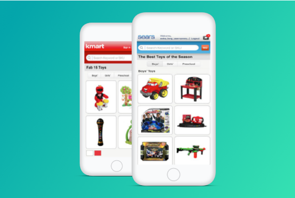
The Kmart Fab 15 Toywall was a new unconventional way that allowed for anyone with a mobile device to scan a QR code, view products, and then add to cart.
Problem
This new and emerging experience at the time, our stakeholders wanted to leverage ways on mobile that would allow our customers to scan a QRcode to make a purchase.
The goal was to make use of QR codes which would allow our customers to scan, browse and ship a product anywhere in the U.S. with three easy steps for the holidays.
The challenge for this new experience was that we ran against the wall; no pun intended trying to understand adoption and utilization of user who use their mobile device and camera to shop. The project was a quick turn-around which really did not offer us a lot of time to really understand the users greater detail.
Action
I served as the User Experience Architect Lead for this project, which meant that I was responsible for understanding the goals and gathering relevant research. Including the planning and execution of:
-
- Landscape Analysis
- Heuristic Evaluation
- Design Sprints
- Application Flows
- Wireframe/Prototypes
I worked with marketing, engineering, developers, visual design, business analyst, and other business decision makers.
Results
The project was 6 weeks window from kick-off to deployment. This was a quick turn-around considering the involvement from various teams and other processes implementations of printing signage for Bus shelters, movie theatres, and airport displays.
Client:
Sears Holdings Management Corporation
Role:
User Experience Architect Lead
Year:
2012
Platform(s):
Android and iOS
Research
As I began to understand the new shopping approach, my research started by thinking through various use cases and context. My journey started by walking the city and observing how QR-code experiences context were being used for various boutiques, restaurants, and retailers.
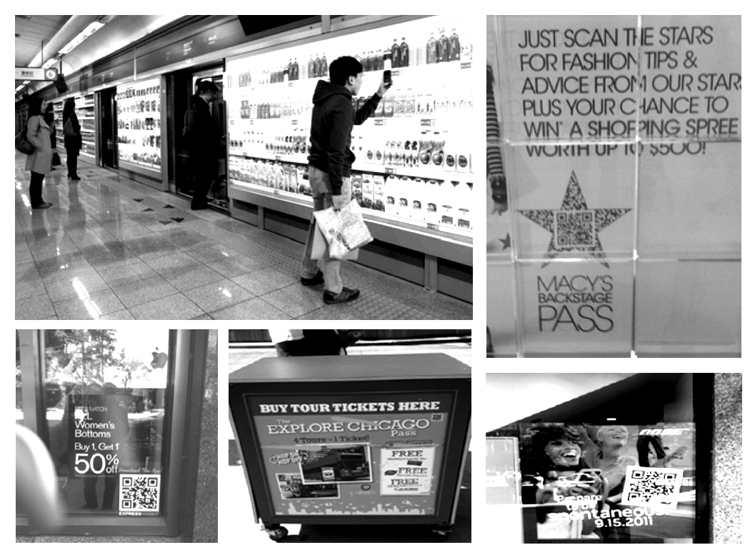
Research Credit: Marcus H.
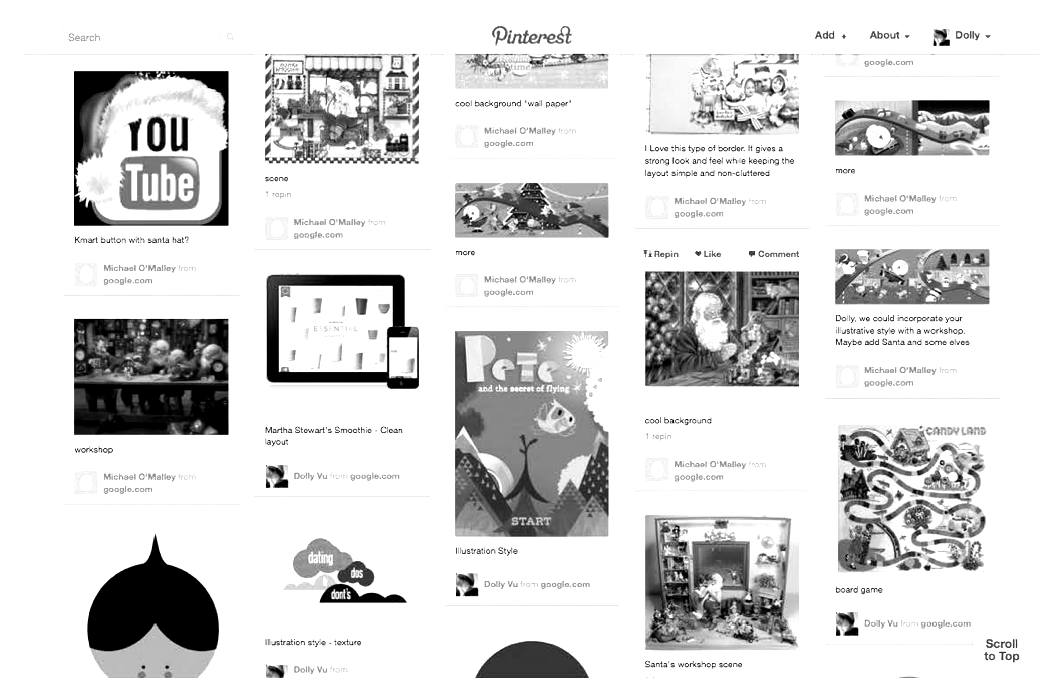
Research Credit: Dolly V.
Sketches
The sketching phase was a collaboration between my self and visual design flushing out what the vision of an offline and online experience would look like base on the information gathering.
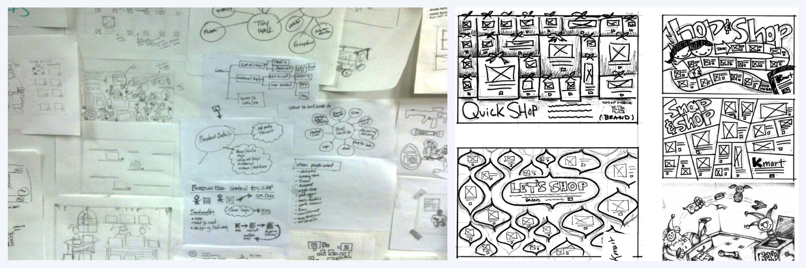
Sketch Credits: Marcus H. Dolly V. Micheal O
Flow + Wireframes
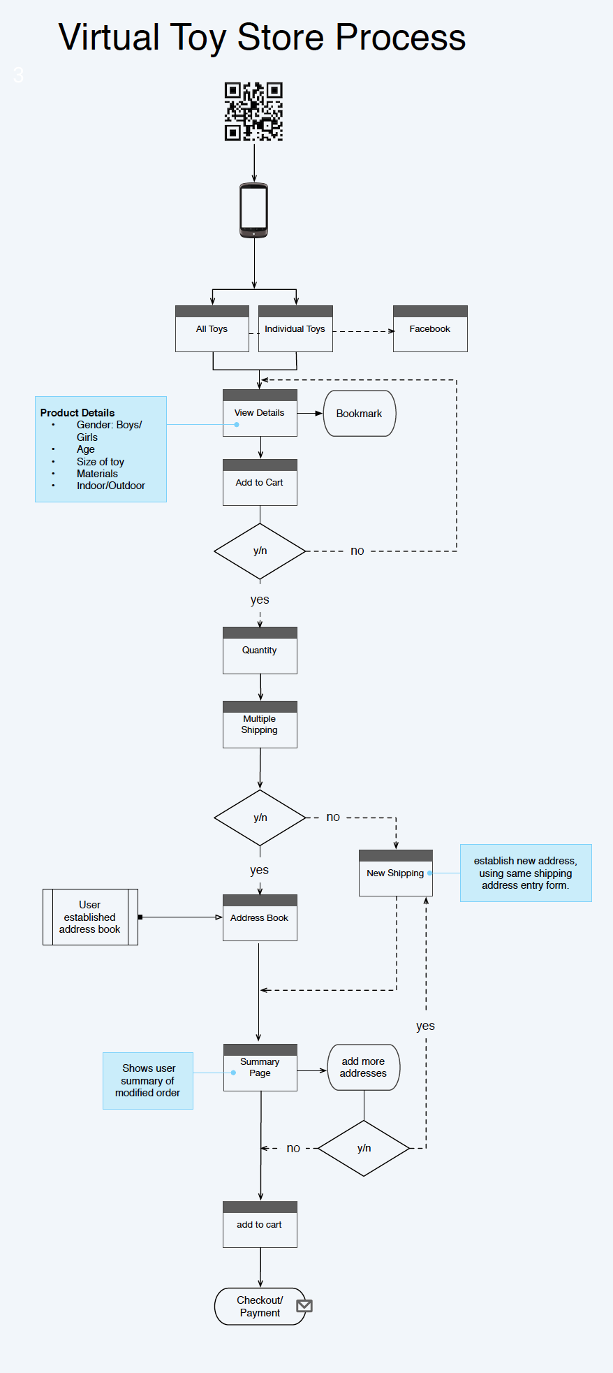
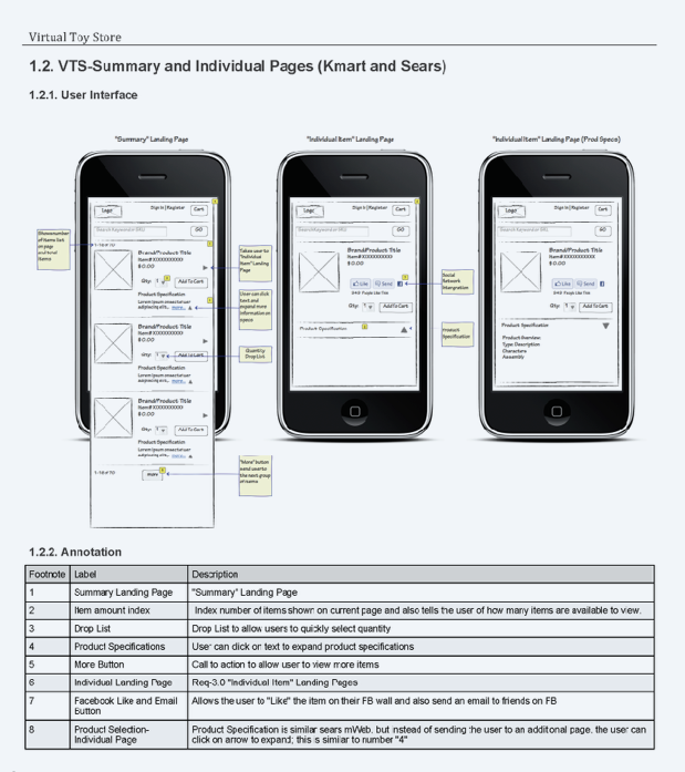
Once the vision was flushed out I began to develop the flow from when the user would scan the wall to completing the transaction. The wireframes were then created to show the user screen task journey.
Visual Design
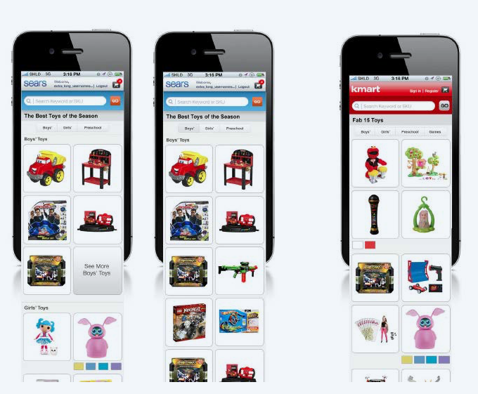
At this part of the process, I worked closely with the visual design team overseeing that design adheres to the experience that was established.
Visual Design Credit: Dolly V. Micheal O.
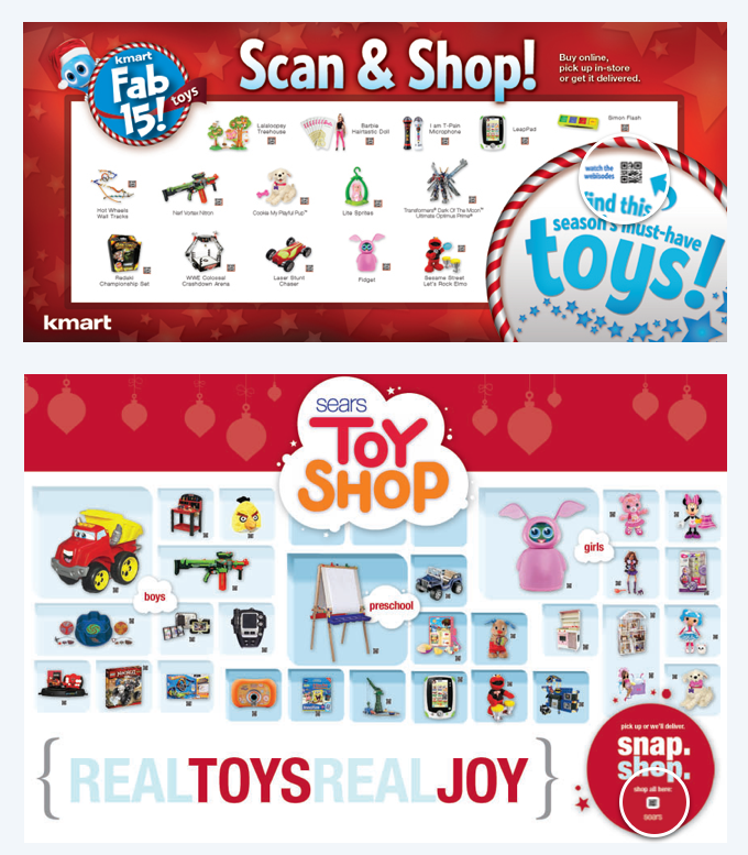
Visual Design Credit: Dolly V. Micheal O.
Final Thoughts
I was proud of the work the team and I did in the short window. I learned so much about the importance of collaboration and being agile and nimble.