Problem
Our stakeholders wanted a more efficient checkout for guest and members (Customers).
There were challenges with the checkout flow being slow for customer fundamental needs; which was to checked-out quickly.
Not only was the process not efficient the team was faced with very little insights into the point-of-sale user experience.
We also were dealing with a legacy system that challenged the teams ability to integrated experiences that allowed for seamless integrations with our web and mobile presence.
The goals were to:
- Reduce the checkout time
- Streamline steps in buy-flows and member account lookup
- Offer e-Receipts as an option
Action
I served as the UX manager and lead. For this project, which meant that I was accountable for representing capturing research and developing UX executions of:
- Ethnographic Research
- Contextual Inquiry
- Initial Requirement discussions
- Brainstorming sessions
- Evaluating competitor product landscapes
- Flows, Wireframes, and Prototypes
Collaborating with Product, Engineering , Visual Design, FED’s, and various business decision makers to align on UX executions and feedback throughout lifecycle of the project.
Results
The initial phase of this project launched about 10 months after kick-off which was aggressive considering the size of the undertaking and numerous system limitations and business/associate processes that needed to be integrated.
Client:
Sears Holdings Corporation (Kmart/Sears)
Role:
User Experience Manager
Year:
2015
Platform(s):
Mobile, Tablet, and Desktop
What did you do
- Responsible for UX teams deliverables in a timely matter
- Led the team design sprints
- Co-lead the daily stand-ups
- Conduct Guerrilla Research
- Create wireframes and prototypes
- Was the subject matter expert for the visual design and front-end development teams to make sure that experience is consistent and following approved design architecture specifications
Overview
The original Sears POS was a product that was driven by older technology and legacy systems. The new POS was redesigned to be web-centric and responsive, this allowed for the POS to scale to any digital platform. With the enhanced POS operating within 700+ stores nationwide and Puerto Rico.
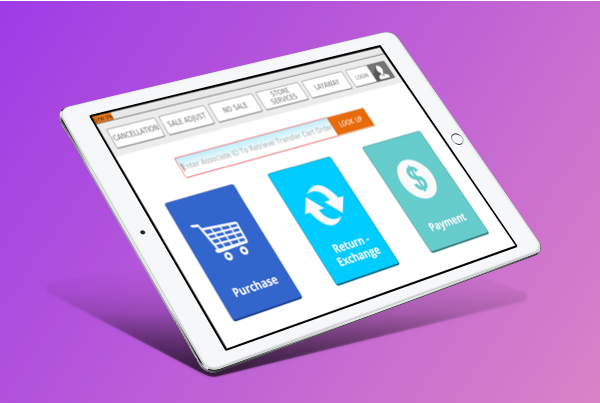
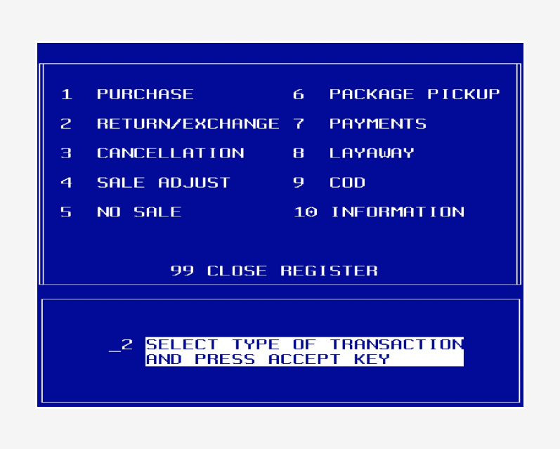
Existing Experience
With the challenges facing us. We had to figure out how we could design a UI that was functional and visual pleasing as well.
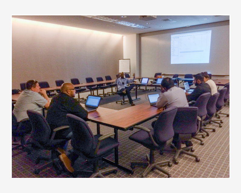
Stakeholder Session– Understanding The Problem
Discussions with product owners and various stakeholders
Research
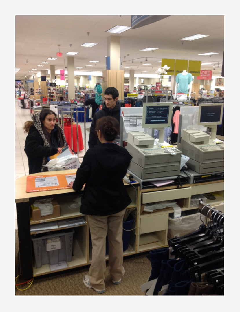
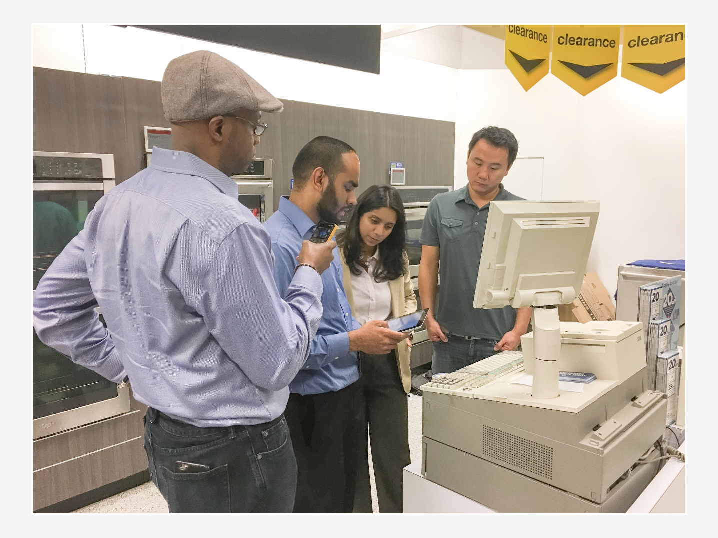
The exploration and discovery phase of this project I conduct contextual Inquiry with associates in store to better understand context and observe feedback of their task and interaction with customers. I also conduct landscape analysis to understand existing products and functions in the market. Once my hypothesis was validated, I started collaborating with the project teams to facilitate whiteboard sessions.
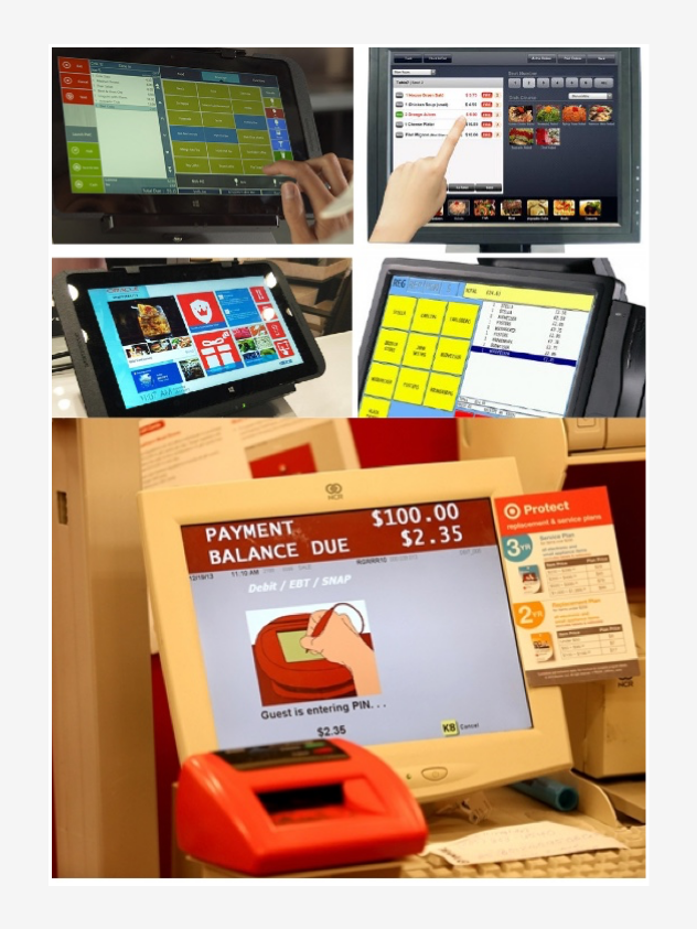
Competitive Landscape
During this stage I began to synthesize information gathered from the competitive landscape analysis on various industry sectors POS payment markets in order to form an opinion.
My research lead me to approach and develop a strategy that would aligned the business goals.
My goal was to understand the various use cases and industry that the POS served a purpose. Through the analysis research I found that most small to mid-size businesses were using square type POS or tablets.
My assumptions led me to believe that mobility and cost played an important part in seeing so many of these POS in action.
Although in the food services industry the platforms and experience were different.
My Insights:
In Boutiques retail and Entertainment sectors
- Tablets and Square type register were common and typically used in small to mid-size establishments.
In Food Services and Big Box Retailers
- Third-party POS and Tablets were the popular platforms.
And at the time digital payment methods were on the rise.
Interviews and Observation
At the empathize phase of my project, I conducted user interviews in order to get a better understanding of the problem.
To better empathize with the associates I ask them questions about what their typical workday, I also ask about their interaction with customers such as their transaction process, what was it like dealing with a loyalty member (customers) versus a guest, I ask them about a typical number of items a customer checkout at the register and any request for online purchases and shipping items from the store to home.
I was curious about:
- The steps it took to start a transaction
- If they felt loyalty membership questions were a factor around completing an order and if so, did it play a factor in the slow down customer’s transaction?
- I wanted to understand the number of average items per order for customer transactions. And what was the primary method of payment?
I engaged with the associates typically when the store opened as this was a better time to have those discussions. Conversations were focus around departments such as (Tools, Outdoor Living, Appliances, and Apparels).
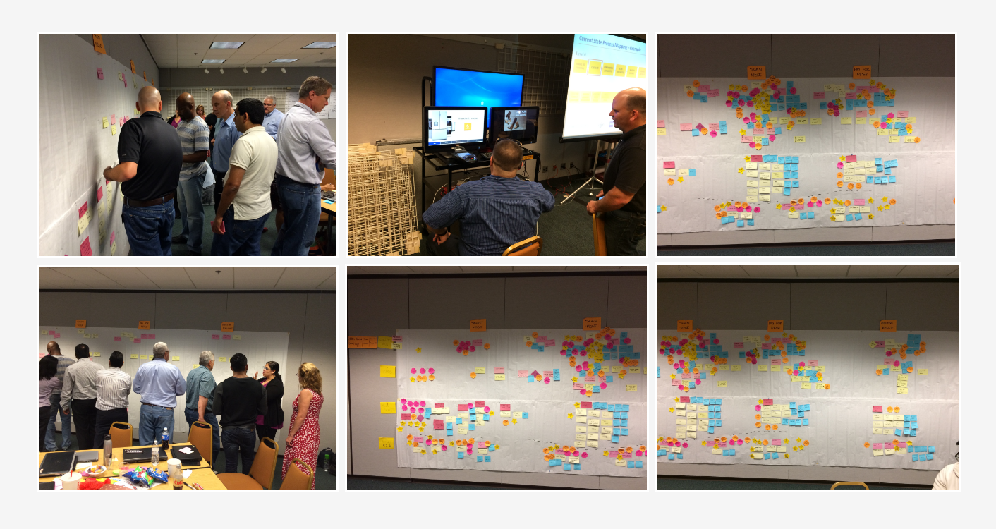
Stakeholder and business workshop to reimagine eCommerce ecosystem.
Workshop
The workshop was conducted after my store visits. I participated and facilitated one of the workshop sessions where I spoke about my findings visiting the stores. The workshop was for one week where we discuss everything from user experience, systems, and POS integrations with our other online and mobile channels.
Our goal from this workshop was to identify all of the POS pain points and capture for requirements and roadmap development moving forward.
Workshop Results
After day five of the workshop we established additional customers and business needs and goals.
All the ideas were document and prioritized for future initiatives.
Insights from this workshop that help me with design goals were:
- Align user journey/flows across the POS ecosystem
- Identify a need to create universal sign-up forms for our member engagement
- Creating economy of scale for future features and functions.
- Integrate inventory and other relevant customer request.
Design Definition
Sketching
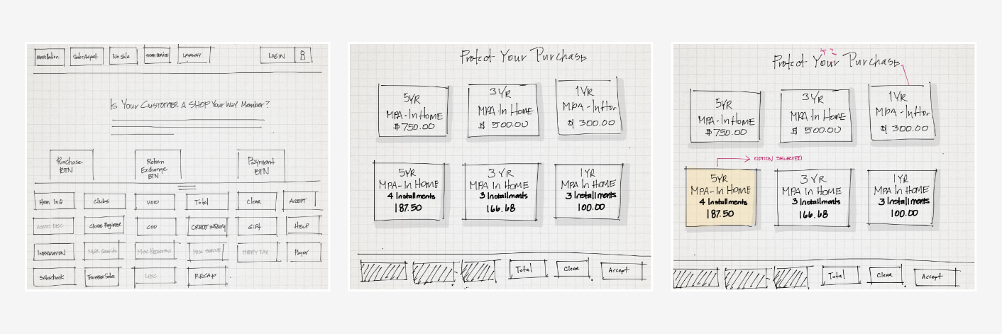
Once the teams were aligned, I started the the ideation phase sketching concepts to evolve the vision of the product goal. During this phase sketches were presented to stakeholders and associates for further feedback base on early inquires and findings.
Flows + Wireframes
At this stage in the process, I created high-level wires and prototypes. These deliverables were created, updated and presented to the team throughout the lifecycle of the project.
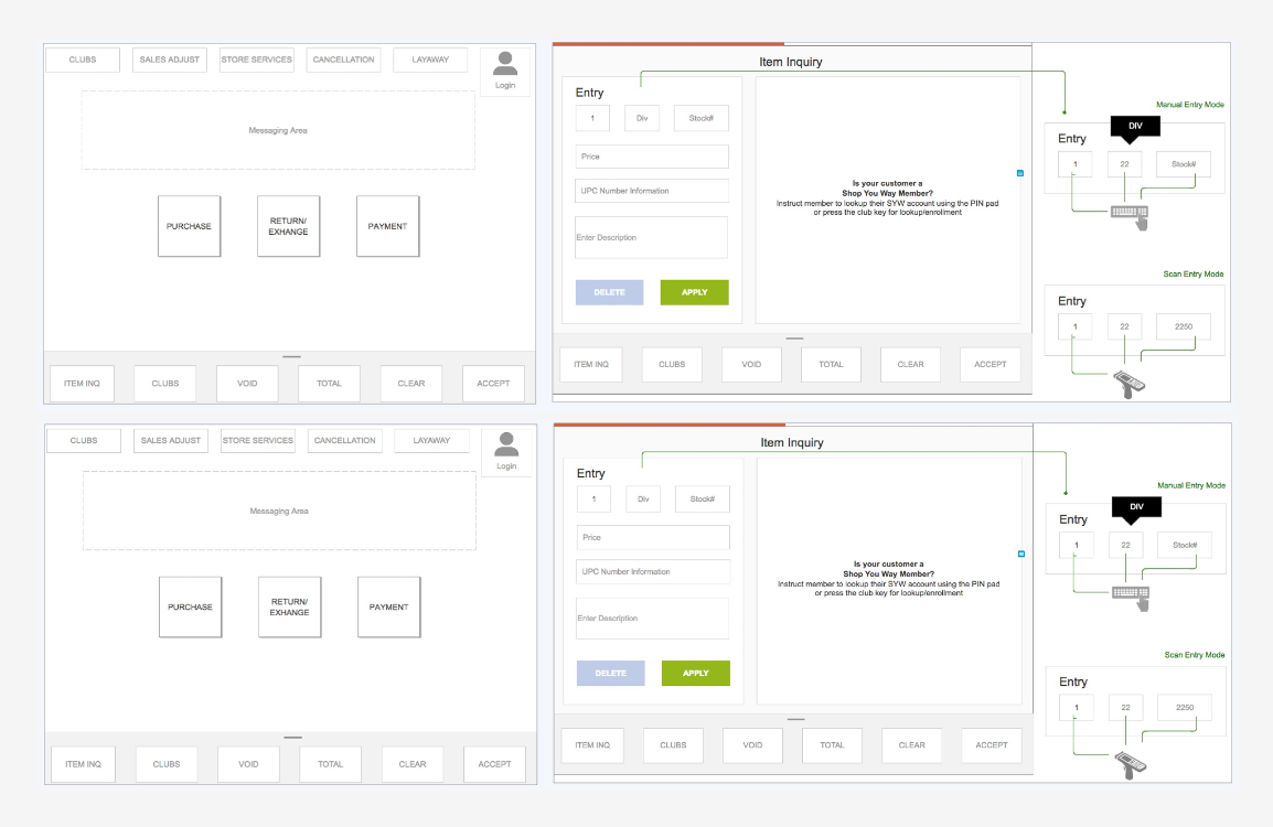
Tools: AxureRP
Design System: Currently developing the design system and refresh UI’s for Fall 2018
Testing
User Testing
The beta testing was one of our last testing cycles before the new experience was to be implemented in 7OO+ stores including our Puerto Rico store.
Before full-launching, the product team and I did testing around core functions and flows in order to reveal possible usability problems. The test was moderated and done on our tablet and desktop platforms used in the store. It was conducted at different times of the day and weeks at the store so that we would not interfere with sales.
The associates who worked in appliances and mattresses received the bulk of the test because of higher margins. The tester was a mix blend of young and older associates.
Beta Test Results
The testers were asked to go through the flow for a typical purchase and in-store transfer.
Results
- The results were that the in-store transfer functions were difficult to find.
- The mattress team could not find critical specification quick enough when asked by the customers
The insights from these tests meant we had issues with the find-ability of the information they needed quickly. From the insights, we were able to have discussions with the engineering team to identify associates in designate departments and display “teach me” screens base on associates’ context.
Visual Design
Throughout the process I worked closely with visual design team on visual harmony and hierarchy and with front-end developers on various platform structures/grids and interactions.
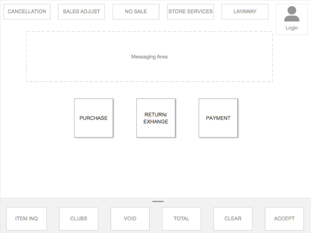
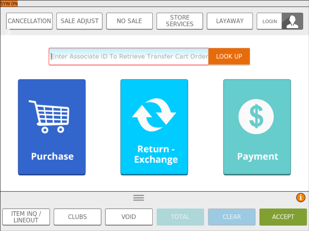
Wire to Visual Design
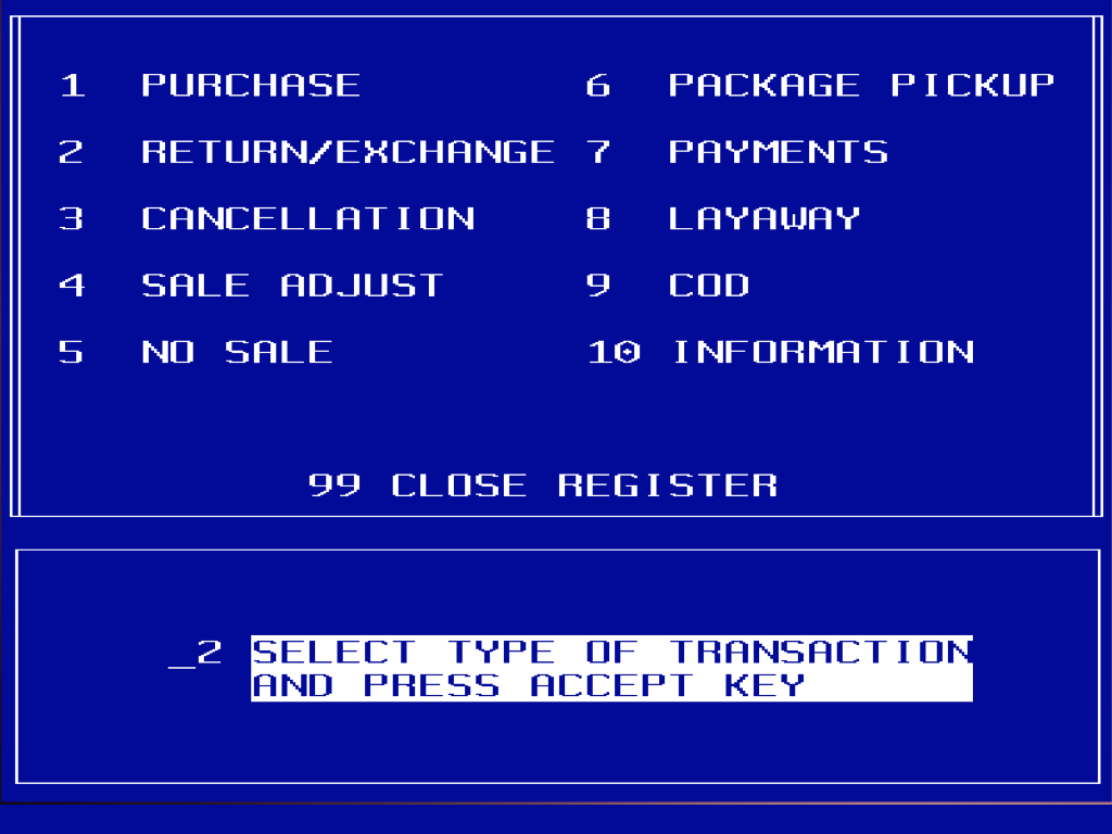
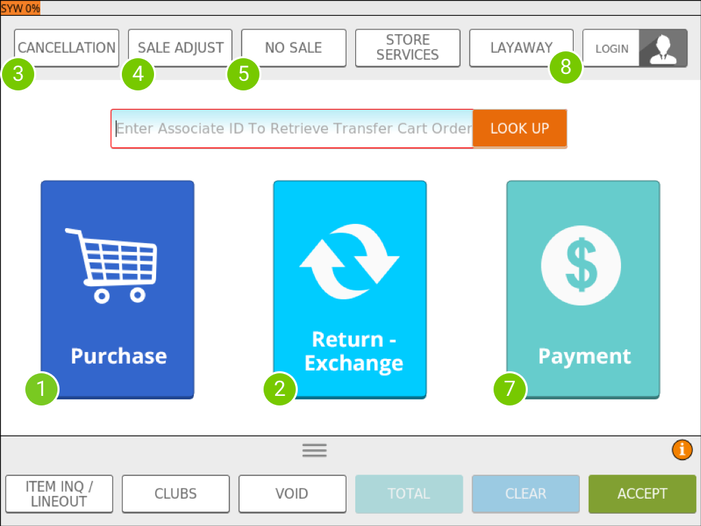
Linux to HTML/CSS
Results
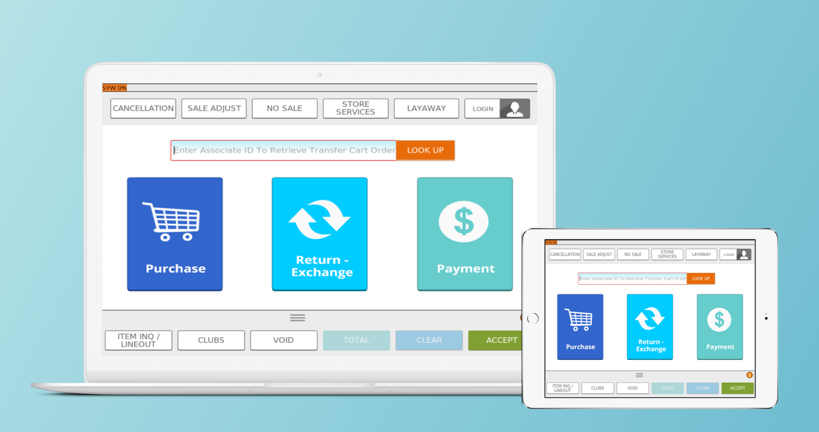
Visual Design Credit: Toni H.
Final Thoughts
As I mentioned earlier this project had many challenges. By understanding the goals, and needs for the users I was able to strategize and implement a lean UX approach. With more time and resources allocated to this project and team we could have solved many other problems.
Results
1.3 Sec
Time Saved at Checkout
3
Usability Test
8
Design Iterations
≈8.5 MM
Monthly Revenue